
The Challenge
With the impending economic slowdown and shift in the agency landscape, MSI saw an opportunity to reinvent themselves, restate who they were, and revisit their future plans. In terms of creative, this meant a new logo, brand system, website, and marketing materials. The rebrand needed to address how MSI fits into the future of advertising and what sets them apart from the 88,000+ other agencies in the nation. New materials also had to maintain a sense of brand equity; clients needed to know that MSI was still the same agency that they knew and trusted.
The Solution
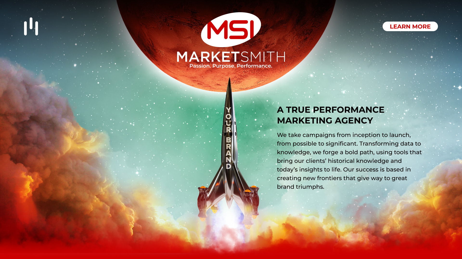
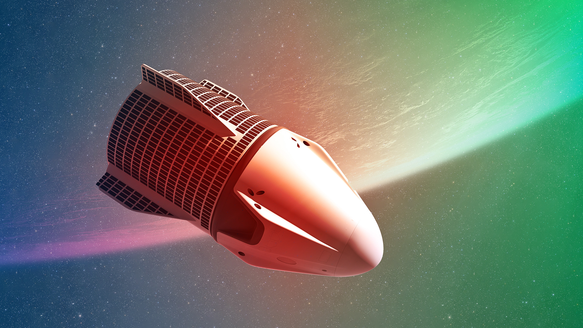
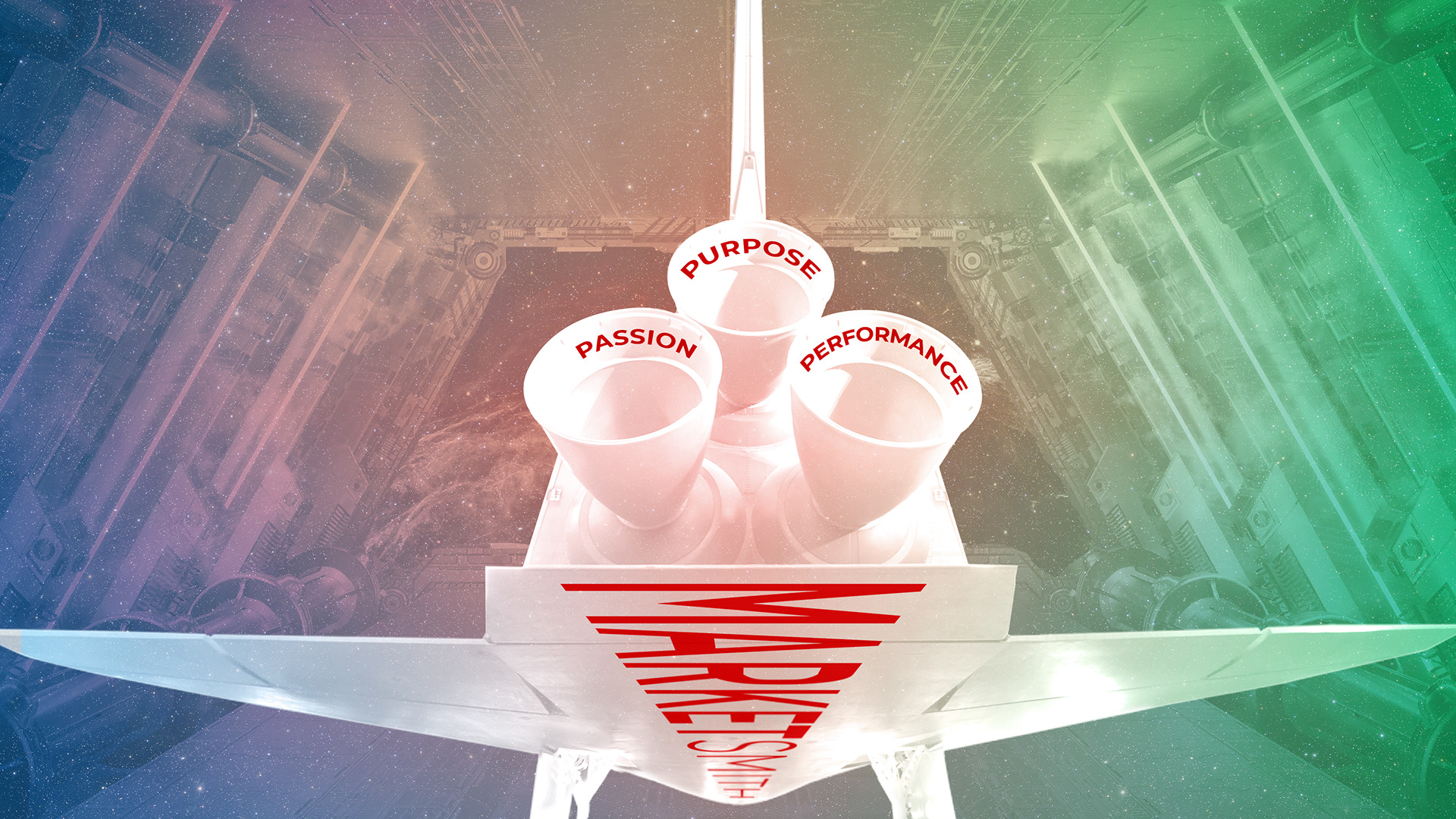
At the end of the day, Marketsmith needed to unleash their full potential. The creative faced fears, challenged the current brand perspective, and used powerful language and imagery to propel MSI into the future. The rebrand presented them as more than just a marketing agency, but a full-service spaceline that launches campaigns and creates new frontiers.
Visual Identity
Old and new were mixed together when crafting MSI’s new visual identity system. Typography and color were carried over to maintain some brand recognition, but a new logo was created by Art Director, Will Roberts. From there, guidelines were set for usage and clear space. Even though MSI stuck with their current typeface, typographical rules and hierarchy were given a much-needed makeover. Furthermore, all this change demanded a new set of brand guidelines. The new document went into more detail and specificity than its predecessor. It also demonstrated a new deck design.
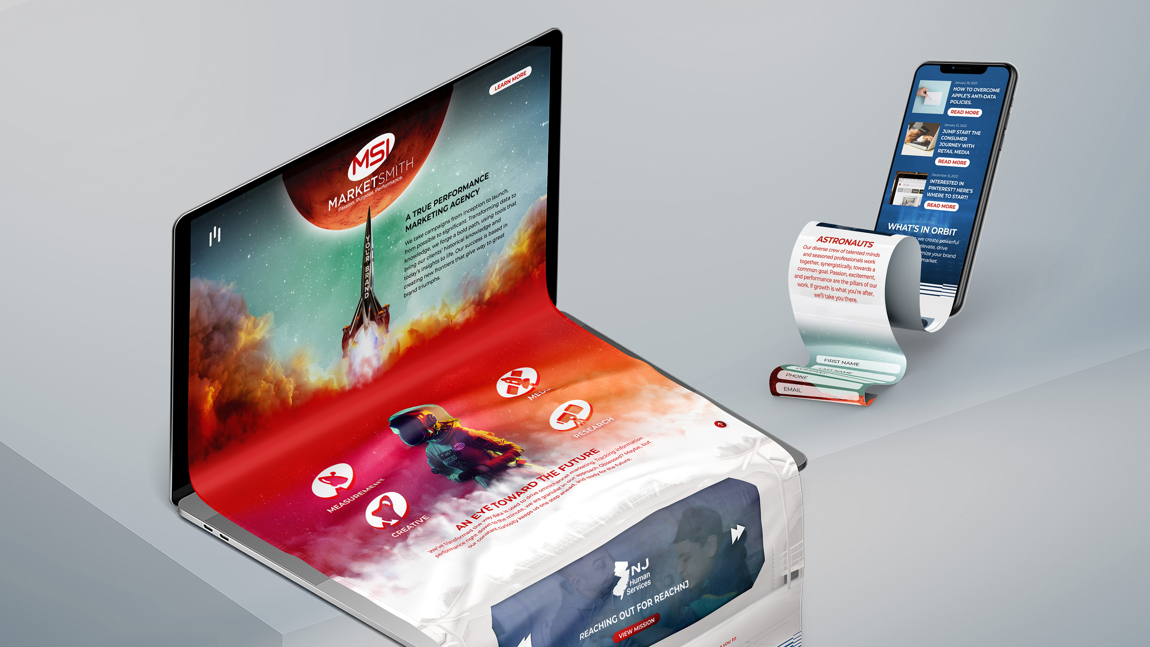
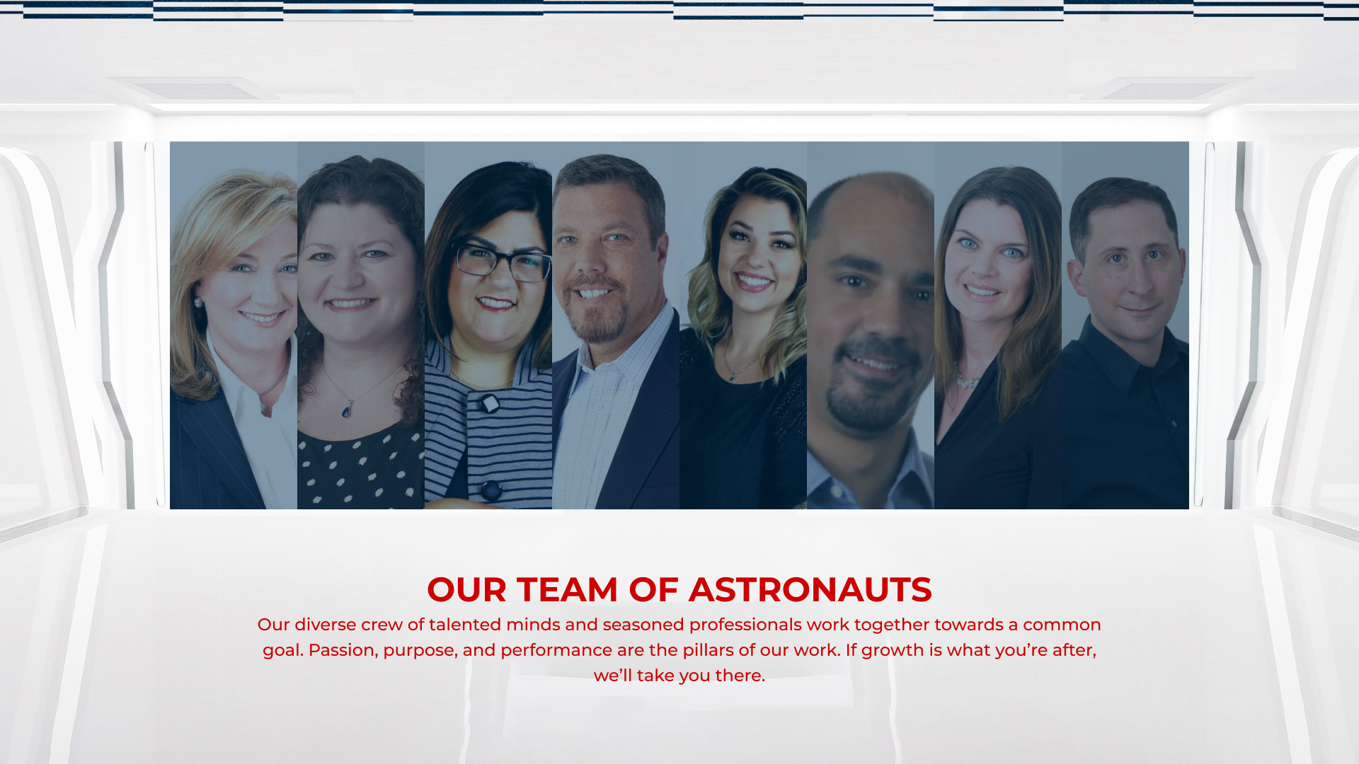
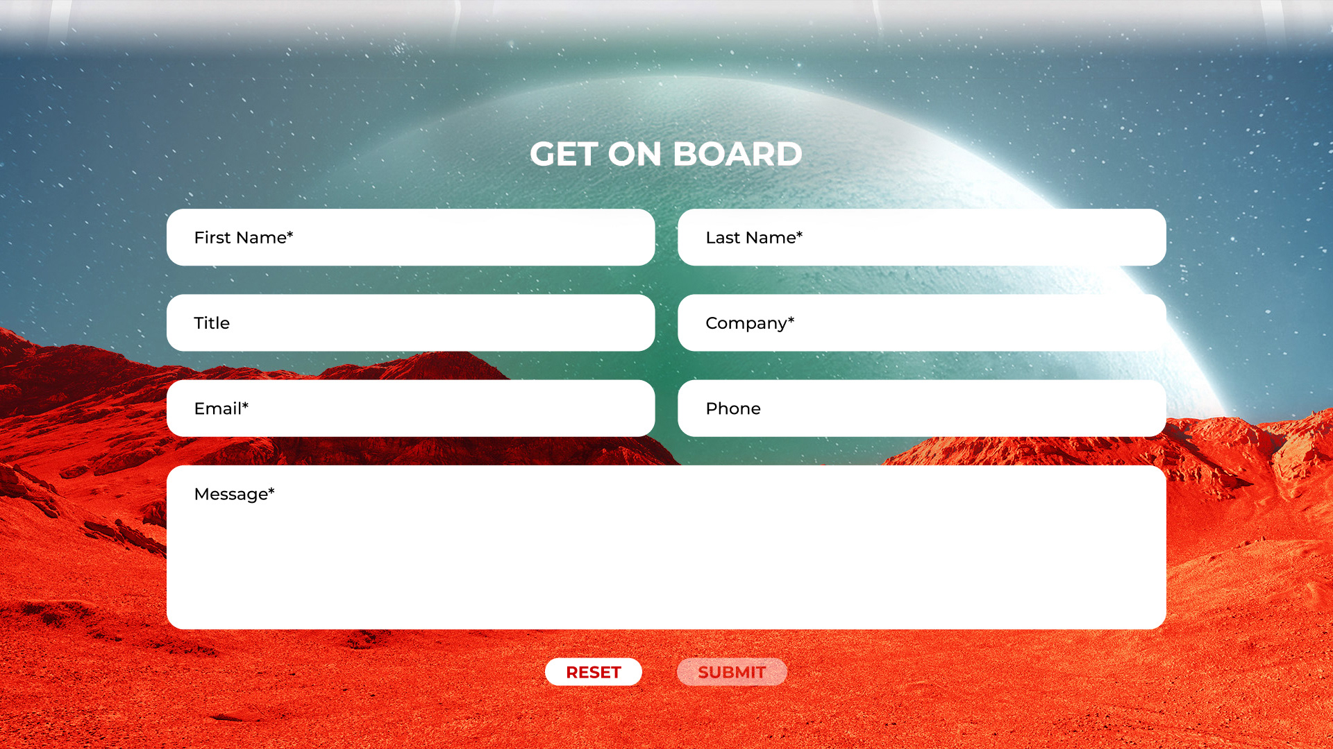
Home Page
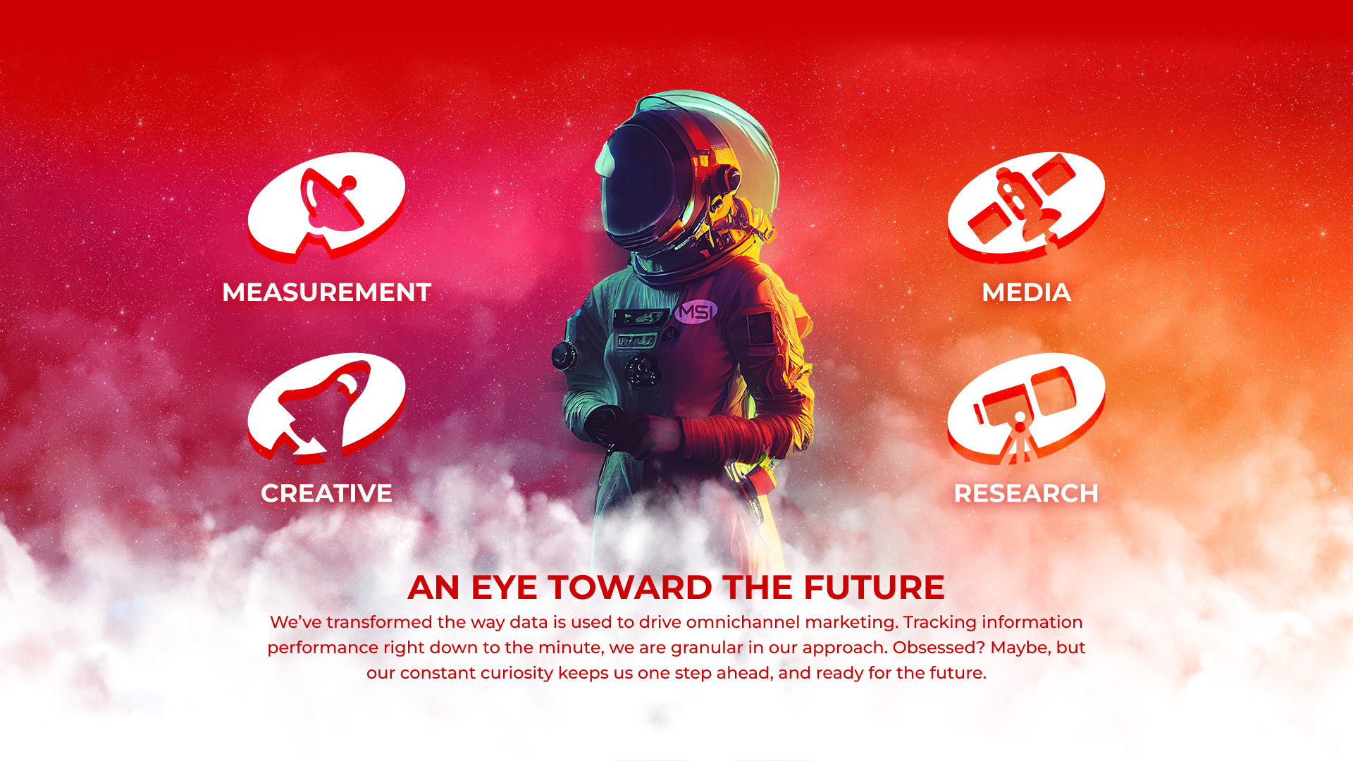
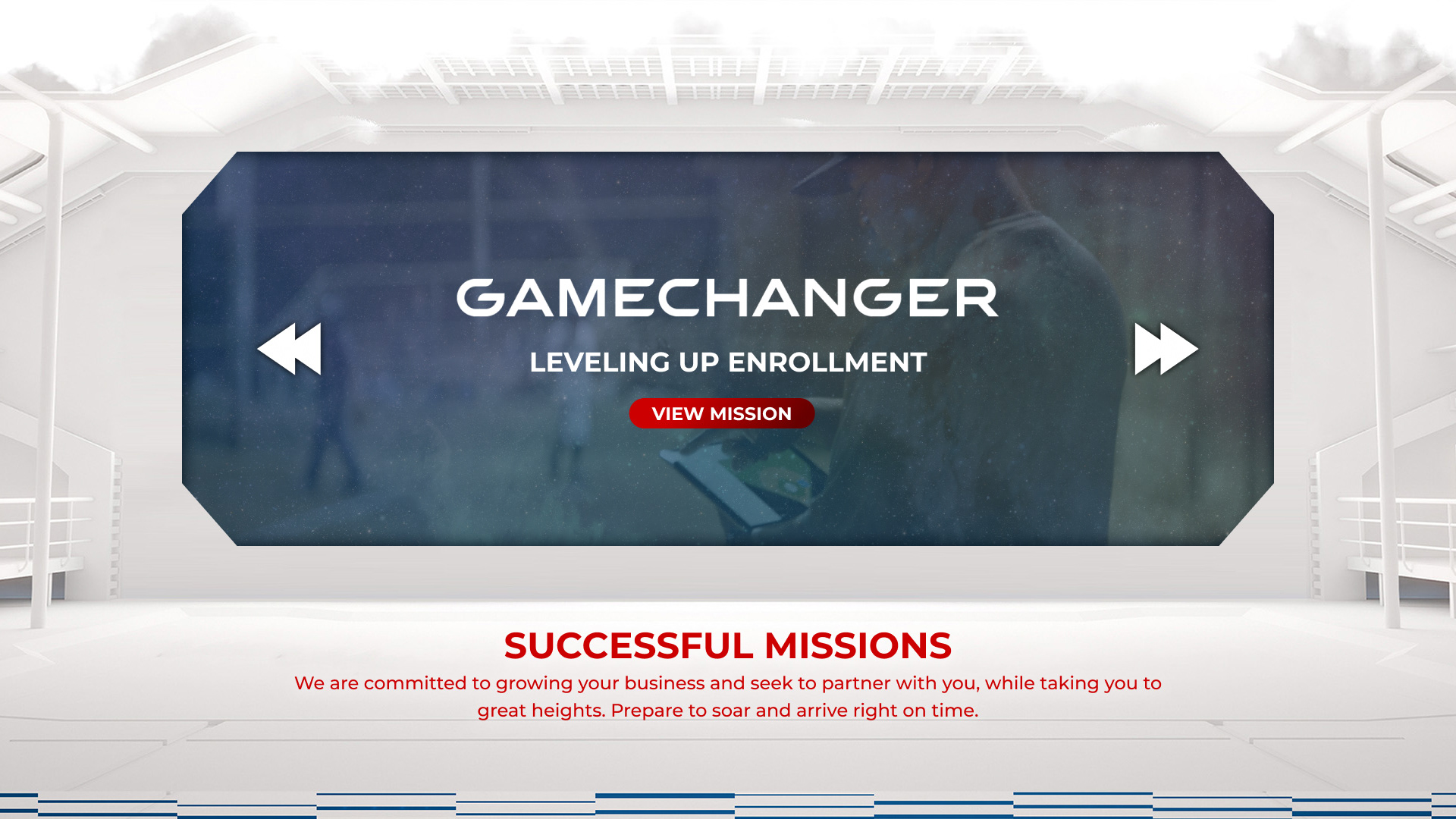
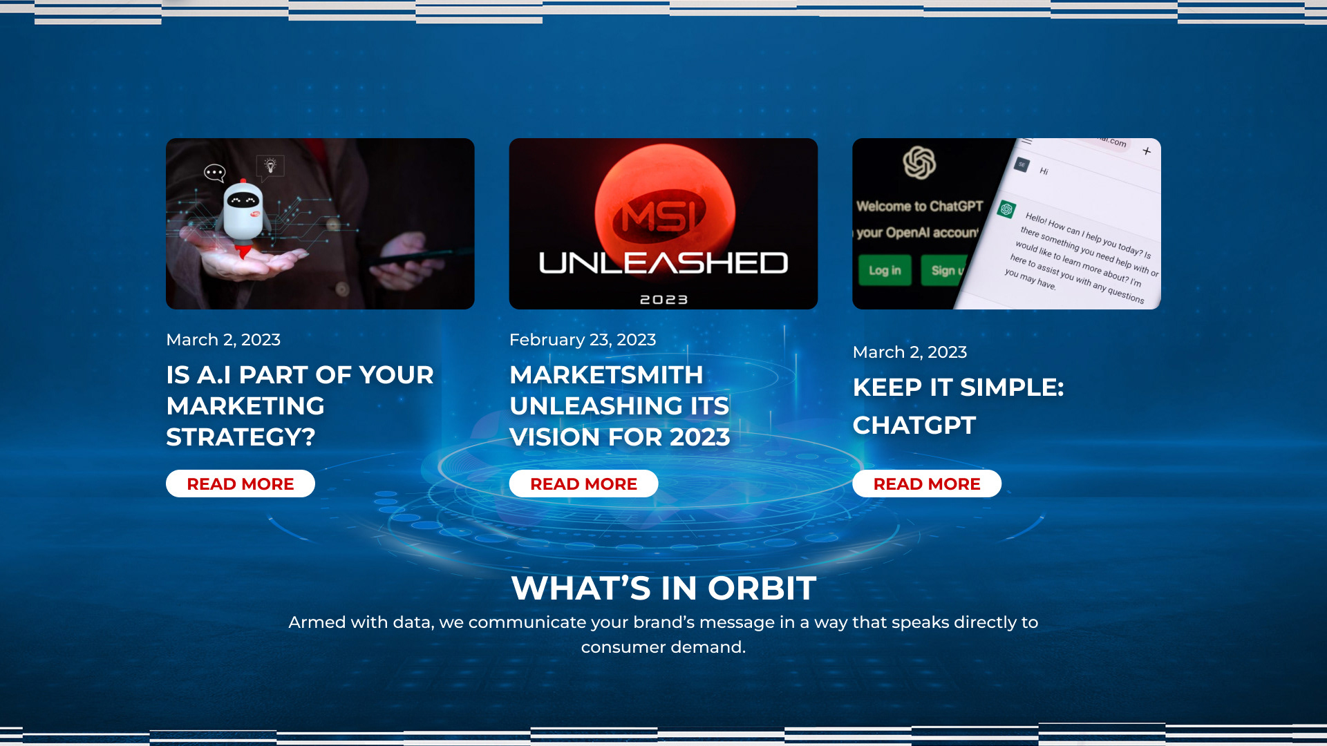
New branding demanded a new home page. MSI needed an eye-catching first impression to reel in prospective clients. The new design utilized a full-screen container while keeping copy and elements to an ideal fixed width. A layout grid was incorporated to ensure proper spacing and responsive consistency. As the user scrolled between sections, well-thought-out background images blended seamlessly together to tell a cohesive story.
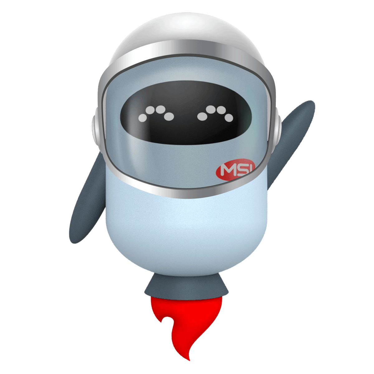
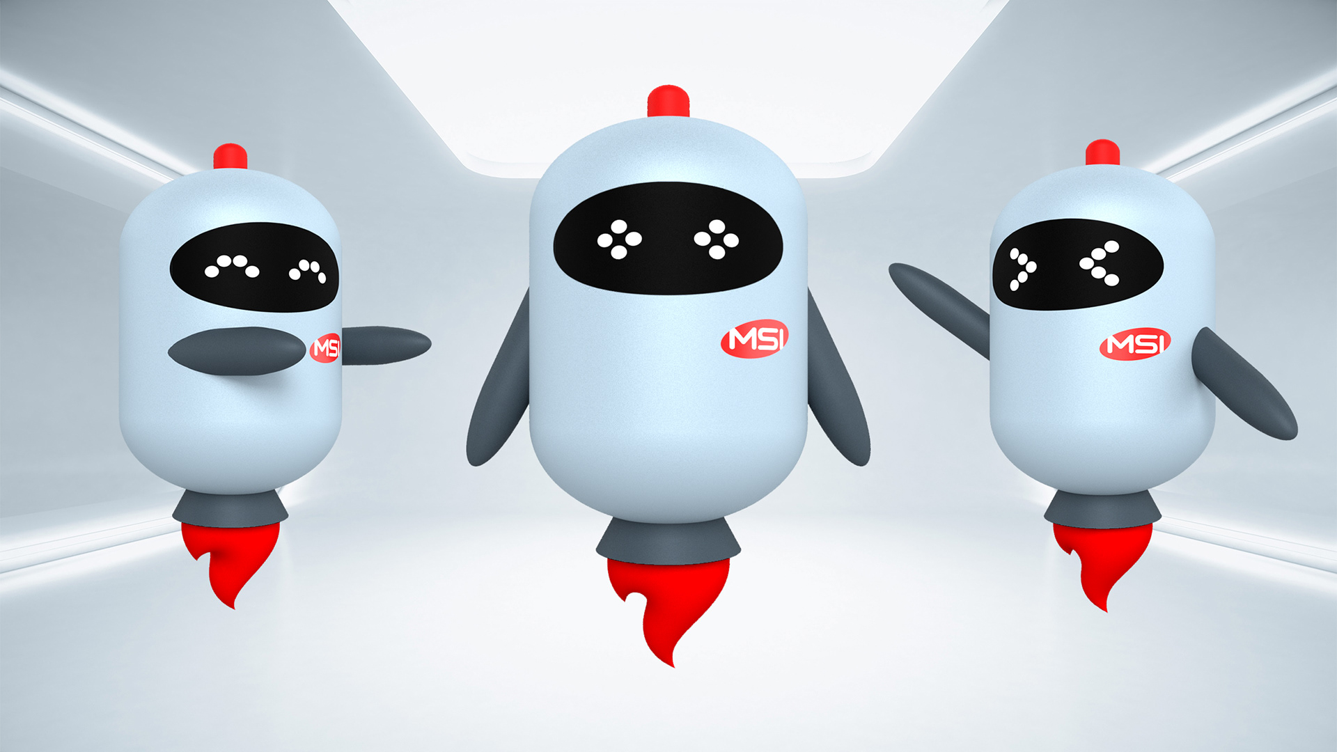
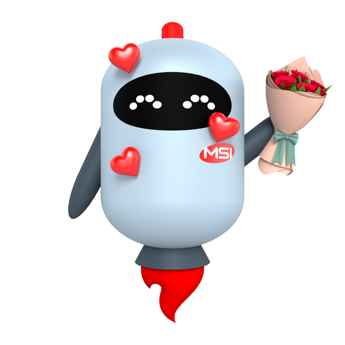
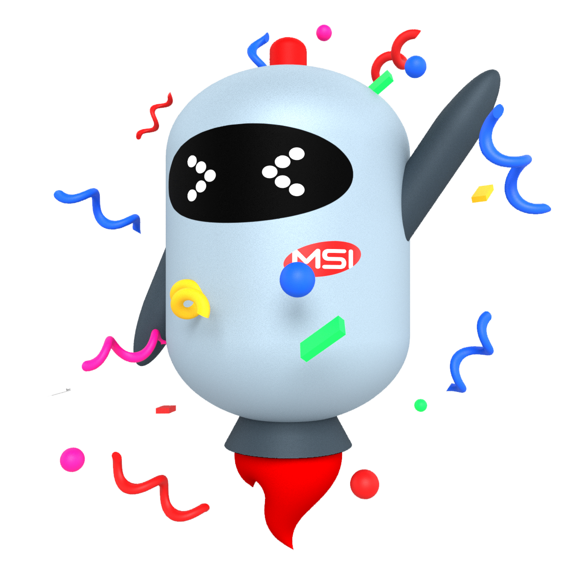
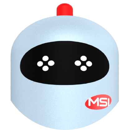
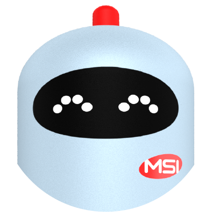
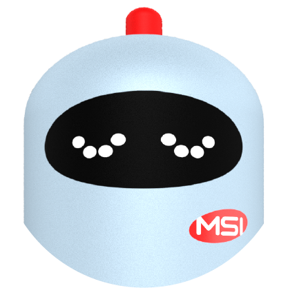
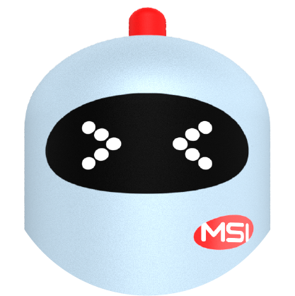
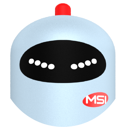
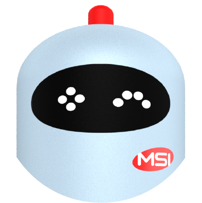
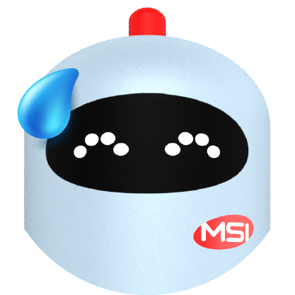
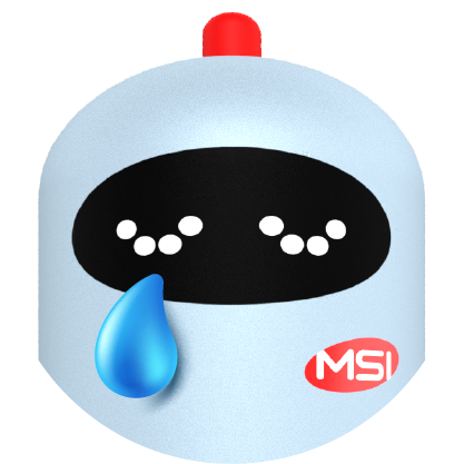
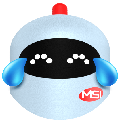
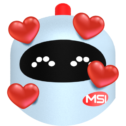
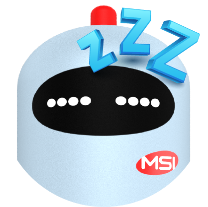
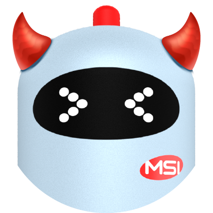
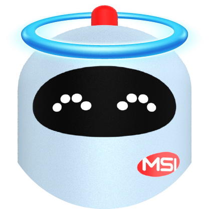
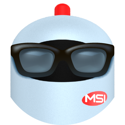
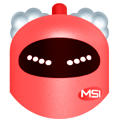
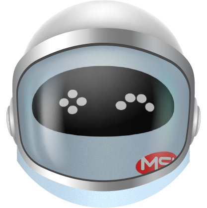
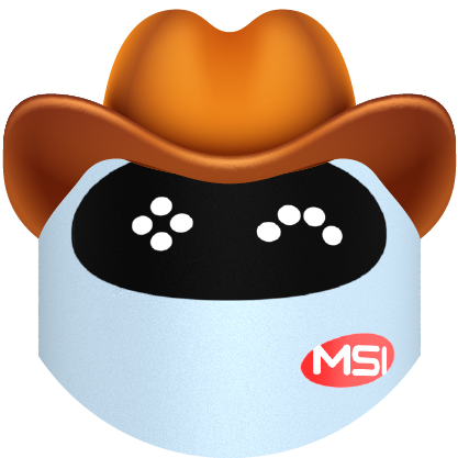
Smithy
Smithy is a blend of all that Marketsmith prides itself on—creativity, heart, and smarts. The official company mascot was designed and rendered for over fifty different expressions, poses, occasions, and activities. Additionally, twenty-four “Smithmojis” were created for internal use.


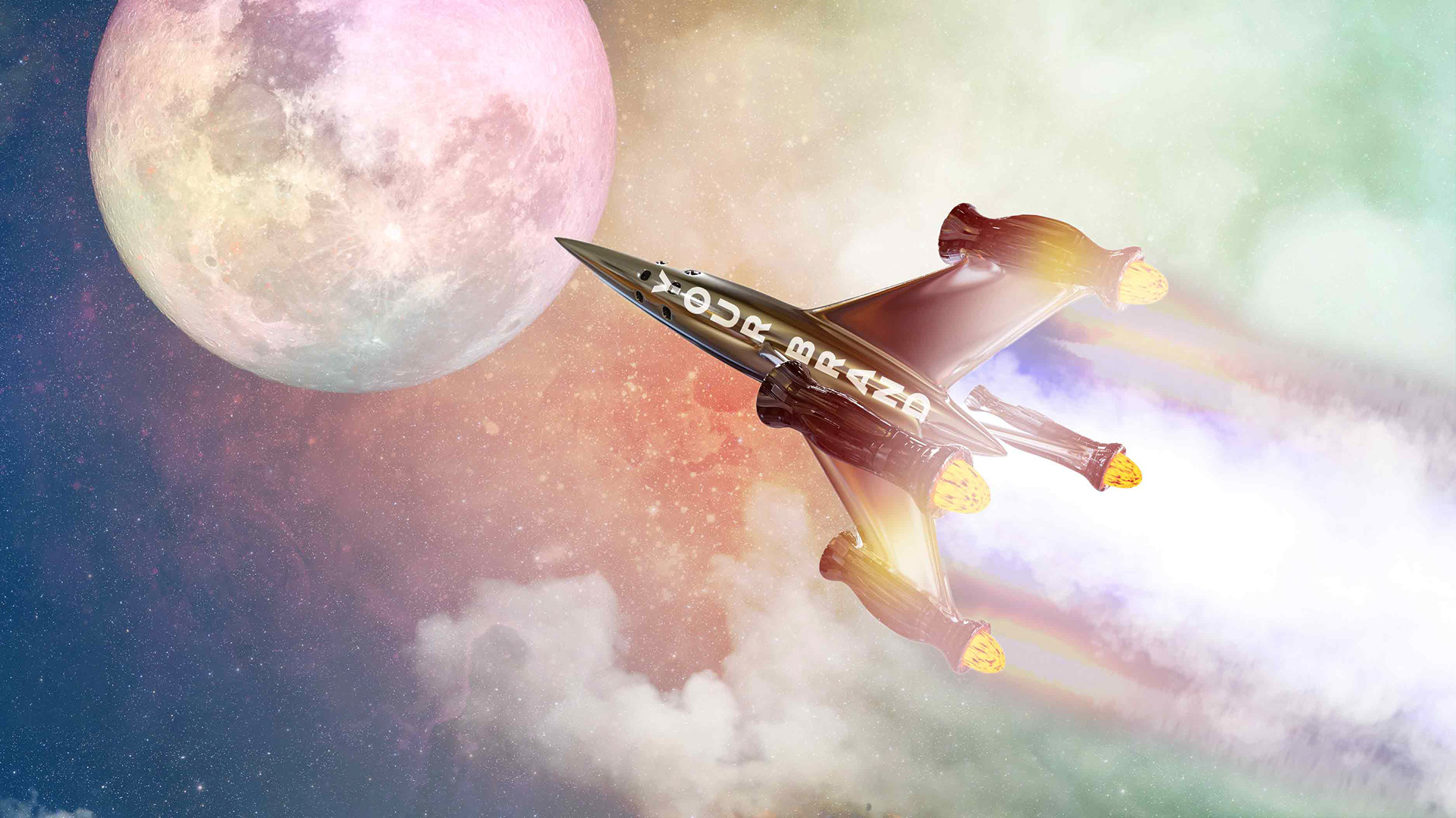
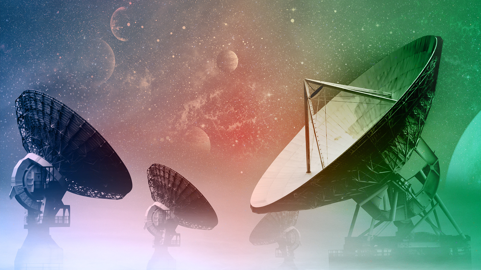
Imagery
The library featured a collection of carefully curated, out-of-this-world imagery with cohesive treatments. The goal was to put together a system that could be used in presentations, social media, web pages, and everything in between.


Agency: Marketsmith Inc; Copy: Portia DePina; Creative Direction: Vince Sia; Logo Design: Will Roberts; Web Production: Ralph Panzullo